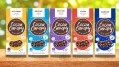
Guest post
Smarties’ new 3D figures are not just for Christmas, but the shape of things to come
When Cadbury launched its campaign to support lonely older people by ‘donating its words’ to Age UK, it relied on its distinctive brand assets to deliver a striking pack stripped of all logos, product names and descriptions.
Left with just the famous ‘glass and a half’ and the distinctive purple colour, the campaign had enormous impact thanks to years of using its brand identity consistently.
As Cadbury’s proved, a thriving confectionery brand’s best friends are its distinctive assets, defined as ‘elements that can signal the brand (and only that brand), even without the brand name being present.’
These have always been part of the branding game and Cadbury’s are not alone in creatively playing with their brand assets. Snickers for example replaced their brand name with words such as ‘Grouchy’ and ‘Hangry’, as part of another successful advertising campaign.
Attention is everything
The fact is that consumers have far better things to do than think about brands. They’re really not waiting for the next TV Ad, new packaging design or Instagram post.
What the majority of brands have neglected, however, is their seasonal offerings. Instead of leveraging their core brand’s distinctive shape and other assets they have tended to offer generic hollow shapes with a bolted-on logo
Distinctive assets provide a mental shortcut to our memories of brands, so even if we didn’t pay that much attention at the time, our brains can still ‘recognise’ a brand from consistently used logos, colours, symbols and shapes and many other attributes. And that ‘re-cognition’ is crucial to getting selected on a crowded shelf, or a smartphone screen.
The power of shape
Packaging and product shape can be especially powerful assets, because they work in 3D and are perceived by sight, sound and touch ‘in the round’.
A quick inspection of everyday confectionery shelves confirms that the sector is awash with distinctive product shapes: From Toblerone and Terry’s Chocolate Orange through to KitKat and Ferrero Rocher, confectionery has embraced 3D for years.
Seasonally generic
What the majority of brands have neglected, however, is their seasonal offerings. Instead of leveraging their core brand’s distinctive shape and other assets they have tended to offer generic hollow shapes with a bolted-on logo.
While some consumers are buying less confectionery on a day-to-day basis they still want to treat their family and friends at key seasonal occasions and are prepared to pay more (pence per gram on seasonal is significantly higher than on standard lines).
As it stands, the total Christmas Market in the UK is worth £910m ($128m) and growing at +4.4% YOY. The hollow figures market has been relatively flat for the last three years, with Christmas sales of £27m ($36m) (Source: IRI).
Little wonder brands are starting to recognise the value of investing in seasonal products to further amplify their brand and increase sales.
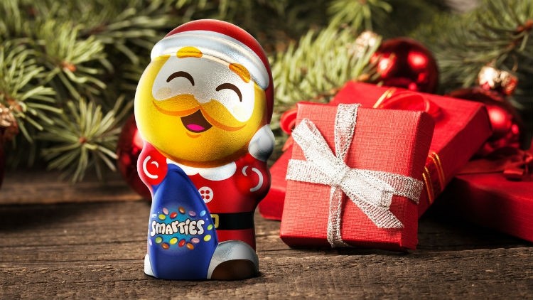
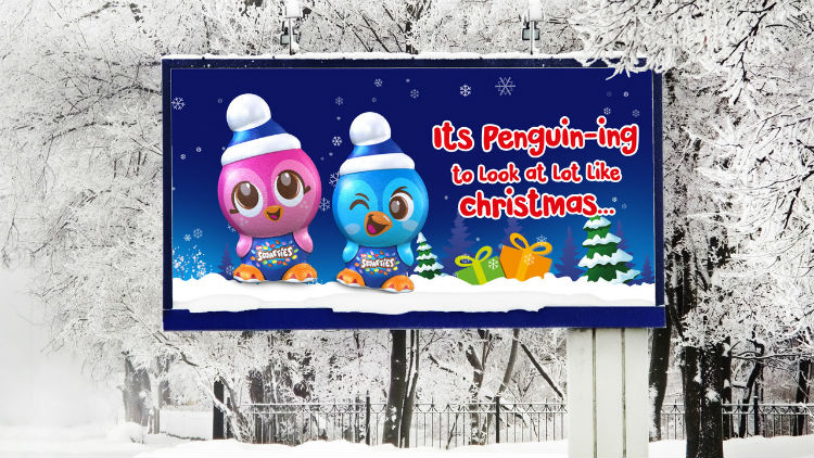
Distinctly Smarties
Nestlé’s decision to shake up the sector by creating something distinctive and exciting resulted in the Icon project for Smarties.
By creating strongly branded 3D figures, supported by branding and graphic design steeped in the assets, the new ‘Smarticons' take a bold step away from generic chocolate shapes.
In terms of design process, early design ideas were shared with mums and kids, resulting in a clear set of requirements for the figures: they had to be recognizably ‘made from’ Smarties in terms of shape and colour, and have the right personality, combining simplicity, playfulness and imagination.
The value of the research was turbocharged by the creation and rapid adaptation of 3D printed figures, allowing consumers to respond to the designs in a natural way, and without getting sticky fingers!
Armed with these insights it took the combined expertise of 2D brand specialists Osborne Pike and 3D innovators Studio Davis to build the brand world with the distinctive assets of Smarties: the specific ‘lentil’ form, the rainbow of colours, the shakeability and the brand promise - to stimulate imaginative play.
The shape of distinctive assets
The new characters have become a 3D symbol of the brand, a novel way to play with distinctive assets, and as such create strong consumer engagement. They’ve also been adapted to work at four different sizes and price points, from an 11g impulse single figure to a full ‘Penguin family gift set’.
Early sales results (eight weeks to 26 October) have shown a +75% YOY increase, comparing the new Smarties Icons versus last year’s more generic figures. Social media reveals that consumers find the characters highly engaging, and as such perfect for gifting and stocking fillers.
This isn’t a one-off campaign either: The Smarties Easter bunnies are ready to follow up on the buzz that their Penguin cousins have created, to increase the ‘mental availability’ of the Smarties brand throughout the year.
- The Smarties Icon project was developed by the combined expertise of Osborne Pike, specialists in creating and managing Distinctive Brand Assets; and Studio Davis, experts in 3D Brand Innovation.