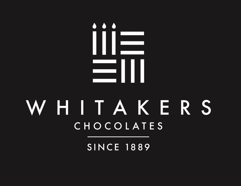
Gemma Whitaker, marketing manager of Whitakers Chocolates, told ConfectioneryNews: “From the outset, we were aware that introducing a new logo would be a balancing act. We wanted to convey that this was a new, reformed logo, but also wanted to stay true to our proud heritage.
“With this in mind, we agreed that we should incorporate our much-loved candelabra into the design and revert to a mono colour palate, therefore paying homage to how the original Whitakers Chocolates logo used to look all those years ago. Overall, I feel confident our new logo achieves this and more.
“The new motif incorporates the prominent line design that feature on our chocolates as well as the candelabra – and the words ‘Since 1889’, the year the company was established.”
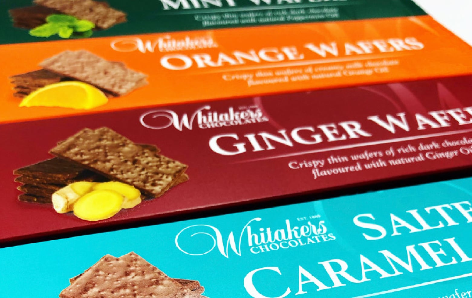
The new logo is the start of a rebranding phase for the family firm, with the development of new retail packaging styles and new product launches set for January 2020.
William Whitaker, managing director of Whitakers Chocolates, said: “This is such an exciting time for everyone involved, not only are we futureproofing the business, we are setting the tone for future developments in this ever-changing world. The feedback on our new logo has been very positive and therefore gives us the confidence to move forward with a wider rebranding programme.”


